Form editor
On the left, you see all the fields and layouts. On the right is your workspace, where you can drag, copy, modify, or delete all the components (fields and layouts). Each component has specific properties.
- To add a component to your workspace, click on a component with your mouse and drag it to the right into your workspace.
- Once you have dragged a component, an additional screen will open to edit this component.
- Components that are in your workspace have extra options when you hover over them with your mouse.
[Settings]: open more options to edit your component.
[Move]: hold down to move a component.
[Copy]: create a copy of a component.
[Delete]: remove a component.

Deleted components cannot be retrieved. They remain permanently deleted.
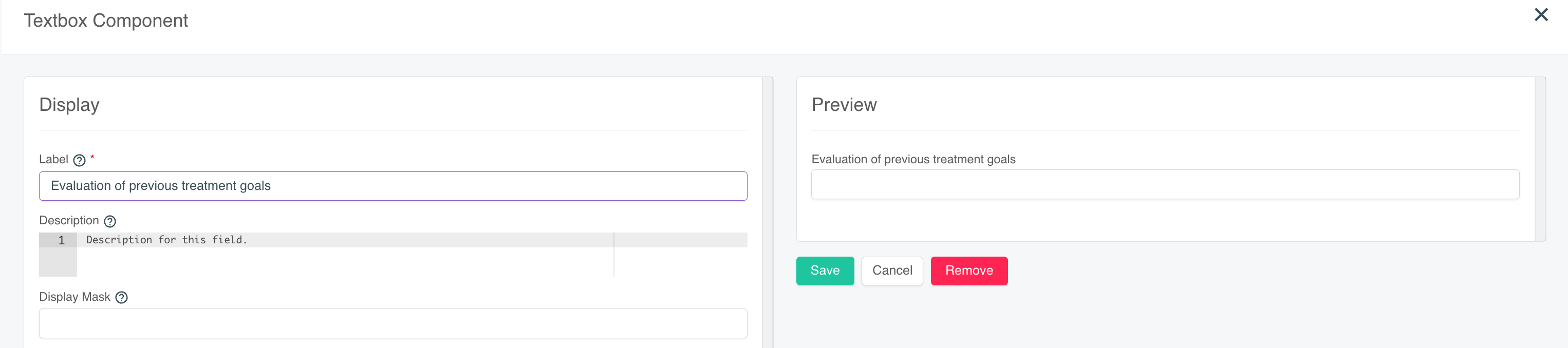
When you add a component, a new screen will open to make adjustments to this component. On the left side of your screen, you have all the options to customize this component. On the right, you have a dynamic preview. This way, you can immediately see how your component will look before you add it.
A. Adding a layout
Before you add fields, it is recommended to first determine the layout of your form. By determining the layout first, you get a better view of how you want to add and organize the different fields.
Table:
- This is a standard table.
- Choose how many rows and columns your table will have.
Veldset:
- Een standaard rij met een titel, handig voor hiërarchie binnen je formulier.
- Kies de naam en legende van het onderdeel.
Panel:
- A bordered zone with a title, useful for hierarchy or distinction between different components.
Columns:
- Useful for adding columns of different widths.
- Add extra columns by clicking the [+ Add columns] button.
- Change the order of the columns by dragging them using the six dots.

The column layout is based on the number 12. To divide a column into 1/3 and 2/3, you would enter 4 and 8 for the column width.
Data Grid:
- Useful for keeping repetitive data fields organized.
- Choose a name for the grid.
- Optionally add a description.
- Optionally determine the name of the button.
When you delete a layout, you automatically delete all the components that fall within that layout. If you want to delete a table consisting of several columns, then these columns and their content will also be deleted.
B. adding fields
After you have determined the layout of your form, it's time to add fields. Fields determine how the input of the various components in your form will look. By default, most fields contain the following information:
- A label
- A description
- Placeholder text
- Data with values and an optional default value
- Validation (this is how you make fields mandatory)
Checkboxes:
- A list of checkable boxes.
- It is possible to check multiple boxes.
Text field:
- Standard single-line field without formatting for entering text.
Text area:
- Standard field without formatting for adding multi-line text.
Formatted text area:
- Standard field with formatting options and multiple lines.
Select box:
- Dropdown menu with multiple options to choose from.
- Only one option can be selected.
Number:
- Standard single-line field without formatting for entering numbers.
Radio:
- List of items indicated by radio buttons.
- Only one option can be selected.
Survey:
- Extensive answer options for things like questionnaires or scales.
- Can be used for, for example, a pain scale from 1 to 10.
Date:
- Standard field where you choose the date via a calendar.
Content:
- Extensive field for entering text with formatting.
- Does not contain options to fill in.
- Useful for things like introductions, extra explanations, or documentation.
Search:
- A dropdown menu with a search function based on a specified database.
Related Articles
Creating an Email Template with the Editor
Go to Settings -> Communication -> Email Templates. Select the appropriate category (e.g., Appointments to select this template when sending the flash mail) and click [+] in the top right corner. We recommend always starting with an existing template ...Creating Forms
You use forms in the EMR. They are linked to a patient's medical history, an episode, or a treatment. You can read how to create a form here. If you want a form to open by default when creating a new patient, episode, or treatment, please read the ...Set default form
A standard form or protocol is a form that is automatically added to the EMR when you create a new treatment, episode, or medical history (upon creation of a new patient). Go to [Settings] and then [EMR]. Click on [Episode], [Treatment Timeline], or ...Sharing a form with a patiënt
Sharing forms with patients is only possible within the [Clever] package. More info regarding the different packages can be found HERE. You can share as many forms with the patient as you wish. an share as many forms with the patient as you wish. You ...C1. Frequently Asked Questions After the Transition (FAQ)
How do I create a new booking link to replace my old one on the website? With Crossuite QI, you can now create and edit your own booking link. The link automatically adapts, so you don't need to replace anything on your website, even after making a ...